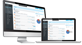
Your website is often the first interaction a prospect has with your brand. Are you putting your best foot forward?
The obvious goal is to make your site “user friendly”; but how is that defined? When you can’t conduct professional user testing, consider the following questions to assess your site’s user friendliness:
Is it responsive?
Today’s web users are accessing internet on a whole host of devices, varying in screen size and model.
A website which is responsive means it is adaptable to all devices, regardless of screen size. Not only should your site be adaptable, but also accommodate to the screen size, so that users benefit from the same quality experience, regardless of device.
Remember, just because your site will scale down to fit the appropriate screen, doesn’t always mean the experience will be up to par.
It’s important to build your site with a responsive approach, focused on creating the best possible layout and user experience for desktops, tablets and smartphones.
Is the text easy to read?
Consider typographic design very closely, as hard-to-read or indistinguishable text will merely be skipped over by prospects.
You can bet if the text is too small, in a strange font or too-brightly color, people won’t spend time to decipher it.
Spacing is another important consideration. Infamously known as “word walls,” failing to break up your text with whitespace will not entice a prospect to read along.
Paragraphs should be maximum 2-3 lines. Consider bolding key points or making use of bulleted/numbered lists to highlight the most important information.
Users will decide on your site in a matter of seconds; skimmable content will enable them to learn what you’re all about quickly.
Does your content offer value?
Not all content is created equal. When creating your site’s content, a key aim should be to focus on quality over quantity. Content isn’t just there to fill up space — it must serve a specific purpose. Otherwise, it has no use on your site or to your customer.
Content is the sole reason people come to your site and is a key indicator of how users will perceive your brand. What are examples of content?
- The product/service you sell
- Articles/news posted on your blog
- Client testimonials
- Infographics
- Free trainings/downloads/software
Content should be relevant and useful to your customer to promote a good user experience.
Is it intuitive?
Site navigation is essentially the control panel. A faulty “control panel” will inhibit a good experience or lead users away from your site.
Identifying what action you want your users to take will inform how you build site navigation.
For example, if your goal is to build your email list and you’re offering a free eBook for any user that gives their email address, make sure your navigation leads them to take this action.
This can be done by strategically positioning buttons in easy-to-see places, embedding links in your text or enabling a pop-up box.
Keep your menu bar clean and simple. Have you ever visited a site where they have nearly a dozen options on the menu bar, all leading in different directions?
While you may indeed have that many built-out pages, you can consider breaking them up into categories and making use of drop-down menus instead.
For example, if you run a bakery which sells cookies, cakes, brownies, baguettes, loaves, custom cakes, cupcakes and catering services, it’s not necessary to give each product an allocated slot on the menu bar.
Instead, you could categorize based on sweets, breads and custom orders. While users like options, they don’t want too many options to the point where it becomes overwhelming.
Are you paying attention to the little details?
Many brands spend hours going over their color scheme, homepage and CTAs — all of which are totally necessary and important, but what gets lost in the bigger picture are the smaller details.
A few smaller details to pay attention to, which could make or break your user experience:
- Typos or grammatical errors
- Broken links
- Outdated information (perhaps you’ve changed the name or price of a product/service, without updating your site)
- Inaccurate contact details
- Overly technical wording or jargon (keep it simple)
Are your built-out pages as good as your homepage?
Plain and simple: don’t put all your eggs in one basket. Sure, the homepage is the poster child of your brand, but if the goal is to get them to click-through, shouldn’t your other pages master the same standard?
What’s more, if a user searches for a specific product or article, they may not even wind-up on your homepage at all!
For example, if a user is searching for a home inspector, they’re going to search for things like “home inspections,” “commercial inspections,” “seller inspections,” etc.
The great part about this is it takes the prospect to exactly what they’re looking for — hold up your end of the bargain by delivering on content and quality, so they have no choice but to take action.
Is your layout efficient?
According to usability experts, consumers evaluate sites in an F-shaped pattern. That is, they start at the top, scanning from left to right, moving down. Makes sense right?
Keep in mind, users love to scan and browse. How many times have you replied to a salesperson with “just browsing?” The same goes for websites! If your site isn’t browse-friendly, users will be quick to abandon ship.
With the knowledge of the optimal layout in mind, position the most important content strategically, so it catches the user’s eye and delivers what they’re looking for.
Want a professional to handle all this for you? Look no further! Schedule your FREE Business Booster Call with our team of professionals.

