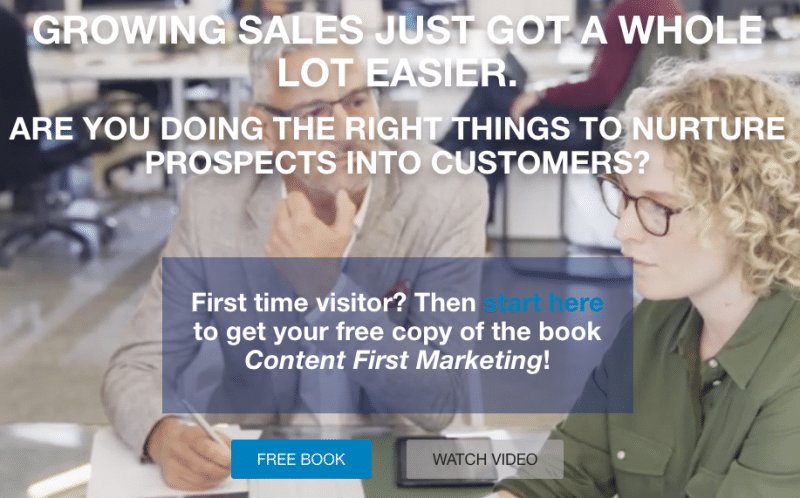
Recently, we have talked about improving your company’s website and using social media for successful digital marketing. But today we’d like to hone in on a very important feature of your website: the landing page.
Are you using your newsletter to tell clients and prospects about your business, products and services?
If not, you could be missing out on a highly worthwhile tool for offering value and connecting with your audience.
However, the success of your newsletter is only as strong as your mailing list and number of subscribers. So, how do we get subscribers?
There’s one sure-fire way: an attractive landing page.
Your landing page is the first point of contact for customers and your business. As we know, first impressions are everything, so it’s important to create an attractive landing page to intrigue users and urge them to stay connected.
If your landing page isn’t enticing enough, users won’t subscribe and will probably not be back. To avoid this, let’s look at a few tips for creating an attractive landing page and ultimately growing your mailing list.
1. Create a Powerful, Attention-Grabbing Headline
You know and understand the pain points of your prospects, so address them! When a user lands on your page, they should immediately be drawn to your headline, and have the feeling “yes, they understand me.”
With the ever-increasing number of options, resources and information available to consumers, it’s no surprise; attention span has decreased significantly. Your goal should be to grab their attention in one sentence or less.
2. Keep Your Copy Brief, Yet Upbeat
The landing page isn’t the place to go in-depth — you’re still courting your prospect. Choose language which is uplifting, inspiring and motivates the user to read on.
Avoid wording that is aggressive or “sales-y”; the user should feel they can relate to and trust your business.
Keep it brief by avoiding “word walls” or lengthy text — stick to paragraphs of no more than three sentences and use the power of bolding to highlight key concepts.
3. Add a Personal Touch
Putting a face to your business can greatly increase credibility and trust. Consider including a photo or video to drive the message home and create real human connection.
4. Use Attractive Graphics
Visuals should be attractive, yet uncluttered. If you’re considering using a series of images, make sure they are consistent and either come from the same source or have a similar style.
Be sure to include an image for your “lead magnet”– your primary offering in exchange for their contact info. For example, getting a free eBook when they sign up for your newsletter.
5. Include Your Credentials
Tell your prospect a bit about yourself, as well as why you’re the expert. If you have testimonials, use them here to grab their attention and position yourself as trustworthy and experienced.
A more in-depth version can be included on your “About Us” page.
6. Don’t Forget a Signup Form
Most importantly, give your prospect the opportunity to stay connected! It can be in the form of a traditional sign-up sheet, pop-up or attached to your “lead magnet”– just be sure it’s visible and simple to use.
7. Track Your Progress
Once you’ve created an attractive landing page and have begun to gain new subscribers, you’ll want to track your mailing list growth.
A key metric to look at is conversion rate or the number of times a user subscribes to your newsletter after viewing your page. This will give you an indication of how well your landing page is working and if adjustments should be made.
There’s always more where that came from– stay in the loop with the ContentFirst.Marketing blog, right here.
Don’t have time to improve your website or come up with a digital marketing strategy to keep track of leads and prospects? We can help! To find out how, schedule your free business growth call today.

